Graphic by MissLunaRose
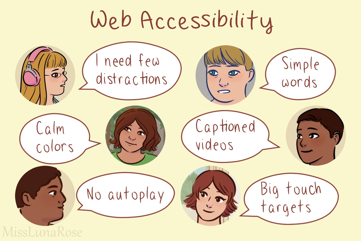
On the internet, web accessibility involves practices that make websites easy to use, including for disabled people. Everyone writing code online, including beginners, should know the basics of web accessibility. This helps make sure you don't exclude anyone.[1] It shows that you care.[2]
Accessibility benefits many kinds of users.[3] For example, simple text helps people with intellectual disability, and also those who are young or who have a lot on their minds. Minimizing distractions can help neurodivergent users and people who are in a hurry. Video captions help deaf people and people who want to watch in public without bothering others. Accessibility helps all kinds of people have a good experience.
Since our main audience is people who code on Fandom wikis, this page focuses on what you can do on Fandom and other wikis. But you can learn even more tips by visiting the pages in our "References" section.
Accessible colors and design
Don't make people scroll horizontally. This can be hard for people with low vision or mobility trouble.[4] It's also annoying.
Use padding and margins so things aren't cramped. Dense content can be hard to read and navigate.[5][6]
Try to avoid surprises.[5] Users should be able to quickly understand what's going on.
Colors
Skip neon colors. Some people are more visually sensitive than others. Bright colors can distract them or hurt their eyes.[5] Because they don't want a headache trying to look at your work, they might give up and leave. Choose calm colors instead.[5]
Color shouldn't be the only way you convey information. This leaves out colorblind users.[4][7][8] Here's an example:
Colors and design with text
Color contrast in areas with text should be good. For example, light gray text on a white background is hard to read.[1][9] The text color and background color should be very different. Examples:
Avoid busy patterns in areas with text. This can distract people when they're trying to read. It could also cause contrast issues, depending on what colors are used.
| Accessibility tip: If you have good vision, try sitting or standing a few feet away from your computer screen. Can you still read the text without leaning or squinting? If not, maybe you need to tweak the design. | |
Accessible images and media
Non-decorative images should have alt text.[7] For example, a background image or small icon doesn't need alt text. But an image that is more meaningful, like a photo or illustration, should include alt text. Alt text doesn't need to include every tiny detail, but it should offer a useful summary.[6][8]
Pick images that are easy to understand. Avoid images that are cluttered or overwhelming.[5]
Background images should be simple, not distracting.[5]
Videos and animations
Skip autoplay on videos or slideshows.[5][9] These can distract or startle people.
Avoid flashing or blinking content.[2][4] This can be distracting and/or visually painful. If it flashes/blinks more than 3x per second, it could trigger a seizure in people with photosensitive epilepsy.[7][9]
Also avoid content that moves quickly, which could trigger motion sickness or be hard to read.[4][5][7]
Videos with words in them should have captions/subtitles. Ideally, offer a transcript too.[5][7][9] The captions should be optional, since a few users may find them distracting.[5]
Accessible text
The text styling should be readable:
- Font size should be easy to read. Don't make it tiny. A good minimum is 12pt (16px).[5][6]
- The font face should be readable. Skip fancy cursive or designer fonts. A clear sans-serif font is often your best choice.[5][6]
- Skip stylistic elements, like huge letter spacing, that make it hard to read.[8]
- Line height should be 1.5-2x the font size. This avoids crowding.[4][6]
- Limit or skip use of all caps.[4][6]
Left-aligned text is easier to read than center-aligned text[7] or justified text.[4]
Your words should be easy to understand.[2] Here are some ways to do that:
- Avoid long sentences and paragraphs. Break them up.[7]
- Write at about a middle school level.[8]
- Include definitions for technical terms and abbreviations.[5][8]
- Be clear, not vague.[5]
- Include examples.[10]
- Use good grammar[7] and a spell checker.
Organize things with clear headings.[7][8] This helps people navigate your text. Put them in logical order. For example, a subheading of h2 should be h3, not h4 or h5.[4] The order of content should be logical.[5]
Use clear text on links and buttons. For example, instead of "Learn more," try "Learn more about accessibility."[4][7]
Common beginner mistakes
Some common beginner mistakes include:
- Choosing lots of neon colors that are hard to look at
- Too much visual clutter
- Using fonts that are hard to read
Beginners might end up overwhelming visitors with things that are too bright, cluttered, or unclear. Instead, put accessibility and usability first. Your designs should welcome users, not make them uncomfortable.
See also
- Color theory
- Comments
- User experience
External links
- Web accessibility on Fandom
- Web accessibility checklist on Fandom
- Digital accessibility and autism at the Autism Living Wiki
References
- ↑ 1.0 1.1 Guidance on Web Accessibility and the ADA, ADA.gov
- ↑ 2.0 2.1 2.2 Evans, Darrielle. Web accessibility: What it is, why it matters, & how to get it right, HubSpot blog
- ↑ Introduction to Web Accessibility, Web Accessibility Initiative
- ↑ 4.0 4.1 4.2 4.3 4.4 4.5 4.6 4.7 4.8 Accessibility tool audit, AlphaGov.GitHub.io
- ↑ 5.00 5.01 5.02 5.03 5.04 5.05 5.06 5.07 5.08 5.09 5.10 5.11 5.12 5.13 5.14 Frankowska-Takhari, Sylwia; Hassell, Jonathan; Autism Accessibility Guidelines research project (PDF), Hassell inclusion and National Autistic Society
- ↑ 6.0 6.1 6.2 6.3 6.4 6.5 Nayyar, Sidharth. web accessibility best practices: 10 tips for inclusivity, WebAbility.io
- ↑ 7.00 7.01 7.02 7.03 7.04 7.05 7.06 7.07 7.08 7.09 Evans, Darrielle. A web accessibility checklist to make your content 100% compliant, HubSpot blog
- ↑ 8.0 8.1 8.2 8.3 8.4 8.5 How to Meet WCAG (Quick Reference), w3 Web Accessibility Initiative
- ↑ 9.0 9.1 9.2 9.3 Easy Checks – A First Review of Web Accessibility, Web Accessibility Initiative
- ↑ Raymaker DM, Kapp SK, McDonald KE, Weiner M, Ashkenazy E, Nicolaidis C, Development of the AASPIRE Web Accessibility Guidelines for Autistic Web Users, Autism in adulthood (2019)