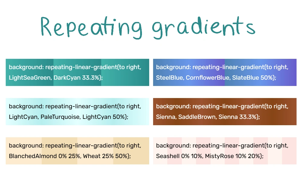
Six examples of repeating gradients
Let's say you'd like your gradient to use a repetitive pattern, but you don't want to code something incredibly repetitive. Luckily, programmers love lazy solutions to problems, so CSS has an answer.
Here's an example:
Prerequisites
To make repeating gradients, you'll need:
- A decent understanding of how gradients work, such as color stops. You can learn from our gradients page and Luna's Quick CSS Gradient Guide.
- Knowledge of how percentages work in math.
Even if your knowledge isn't perfect, tinkering is a great way to learn. Your sandbox can be handy for experimenting with code.
Instructions
To change a regular gradient into a repeating gradient, you need to do 2 things:
- Put the prefix "repeating-" in front of your gradient (either linear-gradient, radial-gradient, or conic-gradient)
- Add gradient stops, but don't go all the way to 100%. Just stop when you've put down the first part of your pattern. It'll repeat from there forward.
For example, maybe you want the same pattern to repeat 4 times. Then you only fill out the first 1/4 (25%) of the area. It'll autofill the remaining 75% by repeating the 1/4 3 more times.
Let's show a non-repeating gradient and a repeating version:
That 50% is important: it tells the code where to start repeating. When it reaches the 50% mark, it goes back to our first color (lavender). We didn't put a gradient stop on the lavender because that is optional.
Repeating linear gradients
A repeating linear gradient looks something like this:
<div style="background: repeating-linear-gradient(to left, lavender, pink 20%);">Text goes here.</div>
Here are some examples:
If you want soft transitions, start and end with the same color. For example, "blue, purple, blue."
To get solid stripes, specify multiple color stops per color. For example, "blue 0% 25%, purple 25% 50%."
Repeating radial gradients
A radial gradient starts at the center and radiates outward. A repeating radial gradient can look like ripples.
<div style="background-image: repeating-radial-gradient(color, color, color 50%);">Text goes here</div>
Examples:
The same principles about soft transitions and stripes apply.
Conic Gradient (with div)
A conic gradient starts at the center and twirls outward, like a color wheel.
<div style="background: repeating-conic-gradient(color, color, color 50%);">Text goes here</div>
Examples:
Repeating even more with background-size
- Main article: Background Size
You can add the CSS background-size property to make tiling backgrounds. You specify a background size using px, %, or something else. Then the background repeats/tiles to fill the space.
When you specify background size, use two numbers or percentages. The first one is for width and the second is for height. For example:
<div style="background-size: 25% 50%">The background tiles are 25% wide and 50% tall.</div>
Here are some examples of how it looks with gradients:
This can get overwhelming quickly, so make sure you're following best practices.
Best practices
- See also: Accessibility
Always think about readability and accessibility. You want your designs to be easy on the eyes. This means:
- Keep it subtle. Avoid intense, neon colors. These hurt some viewers' eyes.
- Keep it simple. Visual clutter overwhelms the eyes.
- Keep good contrast. Text color should be very different from the background color. Don't make anyone squint!
- Keep it padded. Text shouldn't be touching the edge of its container.
Specify your fallbacks. Sometimes, browsers display things differently. Plan ahead:
- Put in a
background-colorin case the gradient doesn't work. - If you're displaying text in a gradient box, specify a text color with good contrast. Remember, some readers use light mode and some use dark mode. Make sure their text color will look good no matter what.